
Former Community – We Moved
🆕 Coached community here, for posts & feedback public community here.
Infographics: sharing, previews, & feedack

Quote from Lucio Buffalmano on June 1, 2021, 11:36 amAnd picked another designer now, with the same initial instructions, amended with Ali's feedback in mind, and with Ali's mock-infographic as the example.
Will show you here the first draft as soon as it's done.
Thank you so much guys :)
And picked another designer now, with the same initial instructions, amended with Ali's feedback in mind, and with Ali's mock-infographic as the example.
Will show you here the first draft as soon as it's done.
Thank you so much guys :)

Quote from Matthew Whitewood on June 1, 2021, 3:32 pmWow, Ali really nailed the infographic design.
The new infographics from the new designer look like a great step in the right direction.I think what you get out of the designer is also social exchange.
I am not sure how much you are budgeting for this design.The most ambitious designers who do higher-order thinking may only work with high budgets.
And they may have their own design agencies.Maybe, for the freelancers that we engage at the moment (I certainly cannot afford the best designers), they would like to get the job done and collect the money.
Although they fail to realise that doing extra & beyond means, they can get recurring customers and even negotiate for more.
Wow, Ali really nailed the infographic design.
The new infographics from the new designer look like a great step in the right direction.
I think what you get out of the designer is also social exchange.
I am not sure how much you are budgeting for this design.
The most ambitious designers who do higher-order thinking may only work with high budgets.
And they may have their own design agencies.
Maybe, for the freelancers that we engage at the moment (I certainly cannot afford the best designers), they would like to get the job done and collect the money.
Although they fail to realise that doing extra & beyond means, they can get recurring customers and even negotiate for more.
Quote from Lucio Buffalmano on June 1, 2021, 3:50 pmQuote from Matthew Whitewood on June 1, 2021, 3:32 pmI think what you get out of the designer is also social exchange.
I am not sure how much you are budgeting for this design.The most ambitious designers who do higher-order thinking may only work with high budgets.
And they may have their own design agencies.Although they fail to realise that doing extra & beyond means, they can get recurring customers and even negotiate for more.
OFF-TOPIC
A quick note on this one:
You're absolutely right.
Part of this definitely has to do with the price people ask for.
And the other part, is also about self-development.
As you also say in the last line, to move out of the lower rung so to speak, is about mindsets and attitudes of self-development.To get to the higher billing, you often -albeit not always- have to "make your bones" in the beginner or mid-level stages before you get to that higher level.
So many designers who now bill high, they often -albeit not always- started billing low or medium.
But they were still putting that higher-order thinking when they were billing low or medium. Maybe not as much -or not as good, as they didn't have as much experience- as when they started billing higher.
But still, chances are very good that they didn't have the "monkey on a typewriter" attitude, not even in the beginning.For example, the developers I stuck with aren't the highest billing ones (yet).
But they already have that higher-level thinking.
For example, they don't do stupid shit like experimenting on a live website, or breaking something else to fix what I asked them to fix only to come back and say "successfully done".OFF-TOPIC
And yes, Ali's infographic was awesome.
I wished there was a button for double-liking or something :D
Quote from Matthew Whitewood on June 1, 2021, 3:32 pmI think what you get out of the designer is also social exchange.
I am not sure how much you are budgeting for this design.The most ambitious designers who do higher-order thinking may only work with high budgets.
And they may have their own design agencies.Although they fail to realise that doing extra & beyond means, they can get recurring customers and even negotiate for more.
OFF-TOPIC
A quick note on this one:
You're absolutely right.
Part of this definitely has to do with the price people ask for.
And the other part, is also about self-development.
As you also say in the last line, to move out of the lower rung so to speak, is about mindsets and attitudes of self-development.
To get to the higher billing, you often -albeit not always- have to "make your bones" in the beginner or mid-level stages before you get to that higher level.
So many designers who now bill high, they often -albeit not always- started billing low or medium.
But they were still putting that higher-order thinking when they were billing low or medium. Maybe not as much -or not as good, as they didn't have as much experience- as when they started billing higher.
But still, chances are very good that they didn't have the "monkey on a typewriter" attitude, not even in the beginning.
For example, the developers I stuck with aren't the highest billing ones (yet).
But they already have that higher-level thinking.
For example, they don't do stupid shit like experimenting on a live website, or breaking something else to fix what I asked them to fix only to come back and say "successfully done".
OFF-TOPIC
And yes, Ali's infographic was awesome.
I wished there was a button for double-liking or something :D
Quote from Lucio Buffalmano on June 3, 2021, 8:00 amFinal infographic from the designer:
And after I've done some personal changes (I decreased the "appeal" quality, but improved the content):
Overall, bad experience with the designer.
But was made up with the TPM community :).Thank you Ali and Matthew, mentioned you both in the caption as well.
And thanks to John as well as he initially provided me with the idea of a simpler infographic to explain social scalping and social exchange manipulations.
I will upload the next one as soon as the other designer comes up with it.
Final infographic from the designer:


And after I've done some personal changes (I decreased the "appeal" quality, but improved the content):

Overall, bad experience with the designer.
But was made up with the TPM community :).
Thank you Ali and Matthew, mentioned you both in the caption as well.
And thanks to John as well as he initially provided me with the idea of a simpler infographic to explain social scalping and social exchange manipulations.
I will upload the next one as soon as the other designer comes up with it.
Quote from Matthew Whitewood on June 4, 2021, 6:54 pmI laughed at the coloured version where the shit is in the briefcase.
I found it quite humerous.And after I've done some personal changes (I decreased the "appeal" quality, but improved the content):
I can see that you have removed the bag and stack of money from the original design!
Overall, bad experience with the designer.
Looks like it's tough to find a good designer.
I have yet to find a good designer for graphic design but I have worked with a Sri Lankan designer who helped me with website design.
I was pretty satisfied with the final design.
We agreed on 1000 LKR per hour (around 5 USD per hour).
Happy to show the final work if anyone is interested.
I laughed at the coloured version where the shit is in the briefcase.
I found it quite humerous.
And after I've done some personal changes (I decreased the "appeal" quality, but improved the content):
I can see that you have removed the bag and stack of money from the original design!
Overall, bad experience with the designer.
Looks like it's tough to find a good designer.
I have yet to find a good designer for graphic design but I have worked with a Sri Lankan designer who helped me with website design.
I was pretty satisfied with the final design.
We agreed on 1000 LKR per hour (around 5 USD per hour).
Happy to show the final work if anyone is interested.
Quote from Lucio Buffalmano on June 9, 2021, 12:49 pmThe 2nd iteration of the design:
And:
Let me know if you guys have any thoughts.
The 2nd iteration of the design:
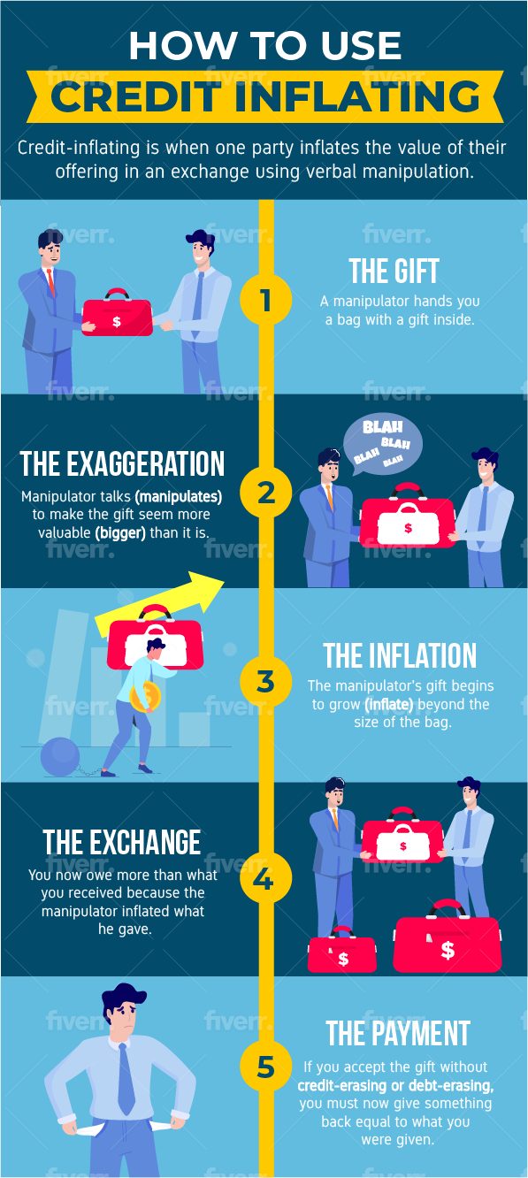
And:
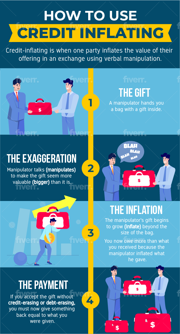
Let me know if you guys have any thoughts.

Quote from Ali Scarlett on June 9, 2021, 1:21 pmThe first one looks cool and I think it has a lot of potential.
Was sort of hoping to see something that really brought the artistic vision and point of view of a professional graphic designer to what we've made and discussed here so far. this feels a bit more copy and paste of what I created (with the exception of professional looking characters and a cleaner overall design). But, it's great to see that the designer was able to get a more well-rounded idea of what TPM needs and is currently looking for.
Focusing on the first infographic, a few of my thoughts are:
- Avoid overcomplicating the gift in the infographic: due to the dollar sign, it's already implied that what's inside the bag is money (or something of obvious monetary value), so there's no need to do the "white gift inside a bigger red bag" show. Simply make the red bag with the dollar sign in step one the gift and then make that same red bag bigger when it inflates in step two. People will get the point.
- Maybe somewhat better grammar: I created my infographic rather quickly, so not all of the wording was the best. Better, might be to say, "Credit inflating is when one party inflates the value of their offering in an exchange through the use of verbal manipulation."
- Illustrate the various forms of credit-inflating: the different ways of credit-inflating can be listed underneath the "exaggeration" step (e.g. the second infographic in this post). And, one of those ways can be used in the speech bubble as opposed to "blah, blah, blah".
- Too much activity in the "inflation" step: I would remove the coin and the arrow. With the "debt chain" wrapped around his ankles and having to carry this (newly) heavy bag around, it sends the same message without distracting or confusing readers. (If one is truly insistent on having more design here, they could illustrate a second chain connecting from the weight on the ground to the bag above his shoulders—further highlighting that the "gift" has now become more of a burden due to the manipulation.)
- Too many bags on the ground in the "exchange" step: Better, might be to simply show the victim giving two bags of the same size as step one's. That would illustrate that the manipulator inflated his offering to be worth twice as much and, now, the victim must do twice as much to make up for it.
Any thoughts on these adjustment ideas?
The first one looks cool and I think it has a lot of potential.
Was sort of hoping to see something that really brought the artistic vision and point of view of a professional graphic designer to what we've made and discussed here so far. this feels a bit more copy and paste of what I created (with the exception of professional looking characters and a cleaner overall design). But, it's great to see that the designer was able to get a more well-rounded idea of what TPM needs and is currently looking for.
Focusing on the first infographic, a few of my thoughts are:
- Avoid overcomplicating the gift in the infographic: due to the dollar sign, it's already implied that what's inside the bag is money (or something of obvious monetary value), so there's no need to do the "white gift inside a bigger red bag" show. Simply make the red bag with the dollar sign in step one the gift and then make that same red bag bigger when it inflates in step two. People will get the point.
- Maybe somewhat better grammar: I created my infographic rather quickly, so not all of the wording was the best. Better, might be to say, "Credit inflating is when one party inflates the value of their offering in an exchange through the use of verbal manipulation."
- Illustrate the various forms of credit-inflating: the different ways of credit-inflating can be listed underneath the "exaggeration" step (e.g. the second infographic in this post). And, one of those ways can be used in the speech bubble as opposed to "blah, blah, blah".
- Too much activity in the "inflation" step: I would remove the coin and the arrow. With the "debt chain" wrapped around his ankles and having to carry this (newly) heavy bag around, it sends the same message without distracting or confusing readers. (If one is truly insistent on having more design here, they could illustrate a second chain connecting from the weight on the ground to the bag above his shoulders—further highlighting that the "gift" has now become more of a burden due to the manipulation.)
- Too many bags on the ground in the "exchange" step: Better, might be to simply show the victim giving two bags of the same size as step one's. That would illustrate that the manipulator inflated his offering to be worth twice as much and, now, the victim must do twice as much to make up for it.
Any thoughts on these adjustment ideas?
Quote from Lucio Buffalmano on June 9, 2021, 1:30 pmYeah, I told him to stick more to your original one as his first attempts seemed a step back:
And two:
Going through the feedback as soon as I can sit down with more focused attention, thank you Ali!
And if anyone else has more to share, happy to read
Yeah, I told him to stick more to your original one as his first attempts seemed a step back:

And two:

Going through the feedback as soon as I can sit down with more focused attention, thank you Ali!
And if anyone else has more to share, happy to read
Quote from Matthew Whitewood on June 9, 2021, 4:09 pmI don't find this intuitive.
It feels mechanical.What about unknowingly bringing a "woman" home and discovering she stands while peeing?
Much more relatable :).
No hate by the way.
Encouraging people to set clear expectations.The Italian suit scam could be another possibility to illustrate social manipulation.
Have you heard about the joke of the devil making hell look more appealing than heaven to someone who is choosing?
Then the devil finally said "That was the trial. Welcome to the reality."Quote from Lucio Buffalmano on June 9, 2021, 12:49 pmThe 2nd iteration of the design:
And:
Let me know if you guys have any thoughts.
I find the earlier one better than the later one.
Because it's hard to understand what's going on in the later one with just the few words.
I don't find this intuitive.
It feels mechanical.
What about unknowingly bringing a "woman" home and discovering she stands while peeing?
Much more relatable :).
No hate by the way.
Encouraging people to set clear expectations.
The Italian suit scam could be another possibility to illustrate social manipulation.
Have you heard about the joke of the devil making hell look more appealing than heaven to someone who is choosing?
Then the devil finally said "That was the trial. Welcome to the reality."
Quote from Lucio Buffalmano on June 9, 2021, 12:49 pmThe 2nd iteration of the design:
And:
Let me know if you guys have any thoughts.
I find the earlier one better than the later one.
Because it's hard to understand what's going on in the later one with just the few words.

Quote from The_Critic on June 10, 2021, 4:40 amQuote from Lucio Buffalmano on June 9, 2021, 1:30 pmYeah, I told him to stick more to your original one as his first attempts seemed a step back:
And two:
Going through the feedback as soon as I can sit down with more focused attention, thank you Ali!
And if anyone else has more to share, happy to read
It's amazing that you invest in infographics, indicates a very healthy business I think.
In 2 the information density doesn't feel right, too much space for too little content, probably because the concept isn't conveyed as clear as it could be (it's not bad, but also not great), but also the example sentences are missing in 2, which gave it quite a bit more depth, so I like 1 better.
Ideas to convey the concept better:
Maybe it could be improved by leveraging idioms like "making a mountain out of a molehill", or "making an elephant out of a mosquito", instead of different sizes of a money bag. On the other hand this makes it harder to connect the concept to the accounting analogy, so price tags should probably also applied.
Another idea is to make the credit inflater look darker clothing wise (e.g. a black suit, or back eyes, more "evil" facial expression) so the dynamic is more intuitive to witness ("bad guy taking advantage of someone else").
In general I (now) assume it's more effective to conceptualize the way you want to convey the idea somewhat in depth beforehand, or you really have a creative genius as a designer, which seems hard to find. Otherwise the idea might not get accross optimally.
Quote from Lucio Buffalmano on June 9, 2021, 1:30 pmYeah, I told him to stick more to your original one as his first attempts seemed a step back:
And two:
Going through the feedback as soon as I can sit down with more focused attention, thank you Ali!
And if anyone else has more to share, happy to read
It's amazing that you invest in infographics, indicates a very healthy business I think.
In 2 the information density doesn't feel right, too much space for too little content, probably because the concept isn't conveyed as clear as it could be (it's not bad, but also not great), but also the example sentences are missing in 2, which gave it quite a bit more depth, so I like 1 better.
Ideas to convey the concept better:
Maybe it could be improved by leveraging idioms like "making a mountain out of a molehill", or "making an elephant out of a mosquito", instead of different sizes of a money bag. On the other hand this makes it harder to connect the concept to the accounting analogy, so price tags should probably also applied.
Another idea is to make the credit inflater look darker clothing wise (e.g. a black suit, or back eyes, more "evil" facial expression) so the dynamic is more intuitive to witness ("bad guy taking advantage of someone else").
In general I (now) assume it's more effective to conceptualize the way you want to convey the idea somewhat in depth beforehand, or you really have a creative genius as a designer, which seems hard to find. Otherwise the idea might not get accross optimally.
