
Former Community – We Moved
🆕 Coached community here, for posts & feedback public community here.
Infographics: sharing, previews, & feedack

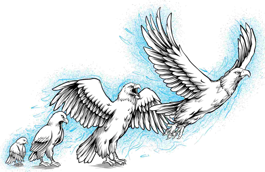
Quote from Lucio Buffalmano on June 28, 2023, 9:50 pmThe final non-colored version.
Next version should be black and yellow to reflect TPM's colors.
The final non-colored version.
Next version should be black and yellow to reflect TPM's colors.

Quote from John Freeman on June 28, 2023, 9:52 pmAwesome!
Awesome!
Quote from Lucio Buffalmano on June 30, 2023, 11:48 pmIf any feedback, happy to read:
If any feedback, happy to read:

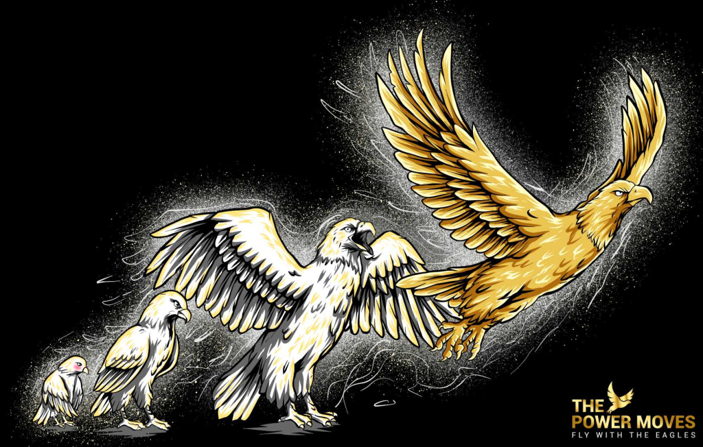
Quote from John Freeman on July 1, 2023, 9:40 pmIn all honesty: at first glance I thought the golden colour was a bit too much. Now that I see it again several hours later I like it more. So I want to preface this with: it’s a great design!
The colour is challenging I think (in this case and generally speaking). Here are my thoughts:
- Using only one colour gives unity. However it also prevents the different drawings from being detached from one another. So it gives unity in exchange for readibility. I wonder if removing the glow would give more readibility to the design.
- Gold is a nice colour I think. I’m wondering if it works better on simpler logos and less on more complex (the « too much » first impression). I don’t know: I’m sincerely wondering. On the website’s banner it works very well I have to say. I think there could be 2 versions: a simpler/more stylized logo (like the banner one) and a more elaborate one. This depending of the size of the logo. Smaller:simpler, bigger: more elaborate.
Based on this I think here are the variants I’m thinking of:
- With/without the glow and keeping them golden
- No gold for the more elaborate design but rather natural bald eagle’s color
- Natural bald eagle colour morphing with shades of white to gold to the golden eagle from the chick to the final eagle
- All chick/small eagles of the natural bald eagle colour and the last big eagle of golden color.
To make things clear: I think the golden colour (especially on black) works well. I think it’s tricky to use as it’s already a « rich » colour, so maybe it needs to be toned down by the shape? Or used only for part of the design to highlight it?
I’m throwing ideas here. Once again: it’s a great design! :)
In all honesty: at first glance I thought the golden colour was a bit too much. Now that I see it again several hours later I like it more. So I want to preface this with: it’s a great design!
The colour is challenging I think (in this case and generally speaking). Here are my thoughts:
- Using only one colour gives unity. However it also prevents the different drawings from being detached from one another. So it gives unity in exchange for readibility. I wonder if removing the glow would give more readibility to the design.
- Gold is a nice colour I think. I’m wondering if it works better on simpler logos and less on more complex (the « too much » first impression). I don’t know: I’m sincerely wondering. On the website’s banner it works very well I have to say. I think there could be 2 versions: a simpler/more stylized logo (like the banner one) and a more elaborate one. This depending of the size of the logo. Smaller:simpler, bigger: more elaborate.
Based on this I think here are the variants I’m thinking of:
- With/without the glow and keeping them golden
- No gold for the more elaborate design but rather natural bald eagle’s color
- Natural bald eagle colour morphing with shades of white to gold to the golden eagle from the chick to the final eagle
- All chick/small eagles of the natural bald eagle colour and the last big eagle of golden color.
To make things clear: I think the golden colour (especially on black) works well. I think it’s tricky to use as it’s already a « rich » colour, so maybe it needs to be toned down by the shape? Or used only for part of the design to highlight it?
I’m throwing ideas here. Once again: it’s a great design! :)
Quote from Lucio Buffalmano on July 2, 2023, 10:04 amBOOM!
Such an aweome, awesome feedback!
Thank you, John!
BOOM!
Such an aweome, awesome feedback!
Thank you, John!

Quote from Ali Scarlett on July 3, 2023, 12:15 amAt first glance, it comes across a bit too cartoonish to me for a site as serious (and scientific) as The Power Moves.
I think it's possible that some of John's feedback above could give this illustration back some of its seriousness (albeit the issue largely seems to me to be the design style).
Still, only my opinion, and maybe many others will (and do) actually love and prefer it this way.
At first glance, it comes across a bit too cartoonish to me for a site as serious (and scientific) as The Power Moves.
I think it's possible that some of John's feedback above could give this illustration back some of its seriousness (albeit the issue largely seems to me to be the design style).
Still, only my opinion, and maybe many others will (and do) actually love and prefer it this way.
Quote from John Freeman on July 3, 2023, 9:56 amYes, good point Ali.
It does have a cartoonish feel to it. And yes maybe making it more stylized or with less details would change this feel. It is tricky.
Also you raise another good point: if one wants to give it a scientific flair then the design could reflect it. Everything that evokes science: like liquid gold becoming solid gold or anything that evokes "hardness" or "well-defined/black and white aspects".
I think lessening the cartoonish aspect would likely improve the design indeed.
Yes, good point Ali.
It does have a cartoonish feel to it. And yes maybe making it more stylized or with less details would change this feel. It is tricky.
Also you raise another good point: if one wants to give it a scientific flair then the design could reflect it. Everything that evokes science: like liquid gold becoming solid gold or anything that evokes "hardness" or "well-defined/black and white aspects".
I think lessening the cartoonish aspect would likely improve the design indeed.
Quote from Lucio Buffalmano on July 6, 2023, 10:59 amThank you Ali, great tip.
I think it maeks a LOT of sense and I now realize that we have gone too far with the cartooization in the "about" section.
For this design, I'm not too sure though that it goes that far.
Also because, I see it as a sign of personal development to learn to "fly higher" from the typical associtaion of what looks scientific/rigorous -or even what is scientific- from what's true -or effective, or good for you-.
That's also, in part, a game, and to be power aware also means recognizing that game.
Still, if you go too far and look sloppy or too cartoonish, then you're totally right and you're probably doing it wrong -I'm just not sure this is case of "going too far"-.The latest iteration is now published in the "Start Here" page:
Thank you Ali, great tip.
I think it maeks a LOT of sense and I now realize that we have gone too far with the cartooization in the "about" section.
For this design, I'm not too sure though that it goes that far.
Also because, I see it as a sign of personal development to learn to "fly higher" from the typical associtaion of what looks scientific/rigorous -or even what is scientific- from what's true -or effective, or good for you-.
That's also, in part, a game, and to be power aware also means recognizing that game.
Still, if you go too far and look sloppy or too cartoonish, then you're totally right and you're probably doing it wrong -I'm just not sure this is case of "going too far"-.
The latest iteration is now published in the "Start Here" page:
Quote from John Freeman on July 6, 2023, 11:12 amMuch much better I think. So now I have a final vision of what it could look like:
Shading from very light yellow to solid gold with a linear progression until the last one where there would be a marked difference just as you chose. That is linear from 1st to 3rd with the 4th one being quite darker yellow than the 4th one. And I think that removing the halo would make it “more serious” maybe.
Much much better I think. So now I have a final vision of what it could look like:
Shading from very light yellow to solid gold with a linear progression until the last one where there would be a marked difference just as you chose. That is linear from 1st to 3rd with the 4th one being quite darker yellow than the 4th one. And I think that removing the halo would make it “more serious” maybe.
Quote from Lucio Buffalmano on July 6, 2023, 9:38 pmAwesome, awesome idea, John!
I may not go for the "progressively more golden" color since we closed the project for this and it may be too much investment for a single picture to pursue once again.
But I did remove part of the background and it looks much more polished and "professional" indeed.
Thank you!
Awesome, awesome idea, John!
I may not go for the "progressively more golden" color since we closed the project for this and it may be too much investment for a single picture to pursue once again.
But I did remove part of the background and it looks much more polished and "professional" indeed.
Thank you!
